 Spreadsheet Confession
Designing for People Who Aren't at a Desk
How to build internal tools for warehouse, field and frontline staff: phone-friendly views, big buttons, minimal typing and offline realities.
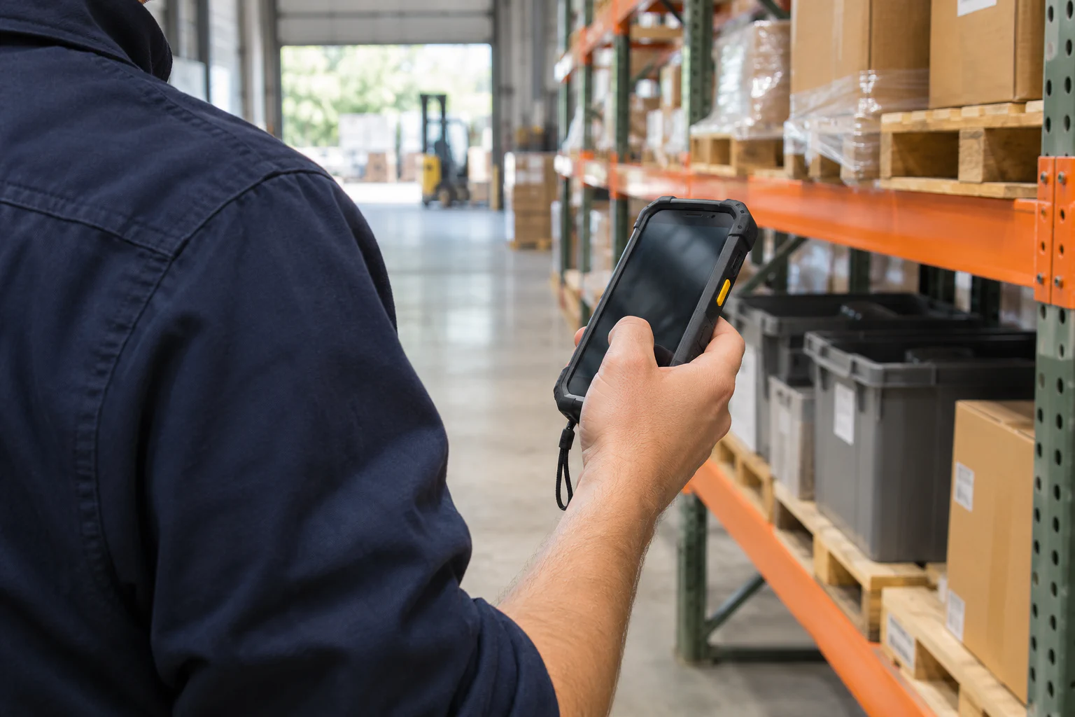
Your new tool looks great on a 27-inch monitor. Then you watch a warehouse picker try to use it on a phone, wearing gloves, under a strip light, with a pallet jack beeping behind them. They tap the wrong row twice, give up, and write the count on the back of their hand to enter later.
That handwritten number is now your data quality strategy. If a meaningful share of your users aren’t at a desk, the tool has to be designed for them first, not adapted for them afterwards.
Know the conditions, not just the users
Desk-based design assumes a quiet room, two hands, a keyboard, a fast connection and a few spare seconds. Frontline work removes most of those. Before you design anything, go and watch the work for an hour. Note the conditions:
- Hands: Are they free, gloved, dirty, or holding something?
- Light and screen: Bright sun, dim storeroom, cracked shared phone?
- Connection: Reliable signal, patchy, or none in the basement or on remote sites?
- Time: Is there 30 seconds to record something, or 5?
- Device: Personal phone, shared tablet in a van, a fixed terminal by the door?
A cleaning crew supervisor checking off sites between jobs has very different constraints from a delivery driver confirming drop-offs at the kerb. The same app can serve both, but not the same screen.
One screen, one job
Desk users tolerate a record with 30 fields because they can scan it. Someone standing in a loading bay cannot. Build dedicated views for frontline tasks that show only what is needed for that moment.
Say your field technicians record job completion. The office view of a job has customer history, billing codes, scheduling notes and internal comments. The technician’s completion screen needs five things: job address, what was requested, a “completed” button, a photo upload and an optional note. Everything else is hidden, not deleted.
A good test: can someone complete the task without scrolling? If not, split it into steps or cut fields. Each extra field on a phone costs far more than it does on a desktop.
Reduce typing to almost nothing
Typing on a phone is slow and error-prone, and typing in gloves is close to impossible. Replace it wherever you can.
| Instead of… | Use… |
|---|---|
| Typing a site name | Pick from a short list, ideally pre-filtered to today’s jobs |
| Typing the date and time | Fill it automatically when the record is saved |
| Typing who did it | Take it from the logged-in user |
| Typing a part number | Scan a barcode or QR code |
| Describing damage in words | Attach a photo, plus an optional short note |
| Entering a quantity | Large plus and minus buttons with a sensible default |
Defaults matter more here than anywhere. If 90% of inspections pass, make “Pass” the obvious single tap and put “Fail” one step further away, where it then asks for more detail. Post 39, “Picklists, Free Text and Everything Between: Designing Fields People Fill In Correctly”, goes deeper on choosing field types; on a phone, lean hard towards picklists.
Big targets, high contrast, plain words
Small details decide whether a frontline tool feels usable or hostile.
- Make buttons large. Thumb-sized at minimum, with space between them so the wrong one isn’t hit by accident.
- Put the main action at the bottom. That’s where thumbs reach on a phone held in one hand.
- Use high contrast. Pale grey text on white disappears in sunlight.
- Label with verbs. “Mark delivered” beats “Submit.” “Report a problem” beats “Exception.”
- Confirm clearly. After saving, show an unmistakable confirmation. People in a hurry need to know it worked without squinting.
None of this is sophisticated. It’s just easy to forget when you’re building at a desk.
Offline is a real requirement, not an edge case
If your people work in basements, rural areas, cold stores or steel-framed buildings, they will lose signal. Ask your platform a direct question: what happens if someone saves a record with no connection?
There are roughly three answers, and you need to know which you have:
- It works offline and syncs later. Best case. Ask what happens if two people edit the same record while offline.
- It fails, but keeps the entry on screen to retry. Workable, if people know to retry.
- It fails and loses the entry. Dangerous. Users will stop trusting the tool after one lost entry.
If the honest answer is the third, design around it. Shorter forms reduce what can be lost. A paper fallback with a clear “enter by end of shift” rule is better than pretending the problem doesn’t exist. Put the question on your buyer’s checklist from “Choosing an Internal Tool Platform: The Questions Vendors Won’t Answer for You.”
Shared devices and logins
Frontline teams often share a tablet in the van or a terminal by the warehouse door. That creates two problems: nobody logs out, and everything gets recorded under whoever logged in first.
Options, from simplest to strongest:
- Ask “who are you?” on each entry with a short picklist of names. Low friction, low security, often good enough for routine logs.
- Use a quick PIN switch if your platform supports it.
- Give each person their own login on their own device where data is sensitive or accountability matters.
Pick deliberately. A safety inspection record signed by the wrong person is worse than no record. Post 16, “Permissions That Make Sense: Who Should See and Edit What”, covers the wider permission picture.
Test it where the work happens
Don’t sign off a frontline tool in a meeting room. Take it to the site. Hand a phone to someone who will actually use it, give them a real task, and stay quiet.
Watch where they hesitate, what they tap by mistake, and whether they reach for a pen. Time it. If recording a delivery took 15 seconds on paper, it can’t take 90 in the app. Fix the slowest step, then test again with someone else.
Where to start this week
- Spend an hour on site with one frontline team and write down hands, light, connection, time and device.
- Pick their most frequent task and design a single-screen view for it with no more than five or six inputs.
- Replace every typed field you can with defaults, picklists, scans or photos.
- Ask your platform the offline question in writing, and plan a fallback if the answer is worrying.